A Font that helps readers remember what they’ve just read.
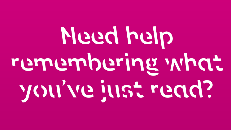
Sans Forgetica is a new font developed by a group of researchers in the Royal Melbourne Institute of Technology. It forces you to absorb each word as you stare at it. Apparently it improves deep cognitive processing by adding a degree of difficulty to the task. There are little sections missing from each character and the font slants the opposite way to normal italics. It’s harder to read and it takes longer to digest so you’re not going to be setting a novel out in this font. But the team developed it reckon, that if it’s used selectively for key quotes, statistics or power statements, it helps students study for exams because they retaining more information.
Making our headlines harder to read isn’t going to work for us ad men, but I admire the way they addressed the very real problem of making boring text memorable to students.
And it’s a good example of how a little creative thinking can make a big difference.
Designers can download it for free here: http://sansforgetica.rmit/
Steven Fairclough
Nice article Donal!